The beige problem isn't AI's fault
The argument about AI flattening design misses the point. We were already doing it to ourselves.
The argument about AI flattening design misses the point. We were already doing it to ourselves.
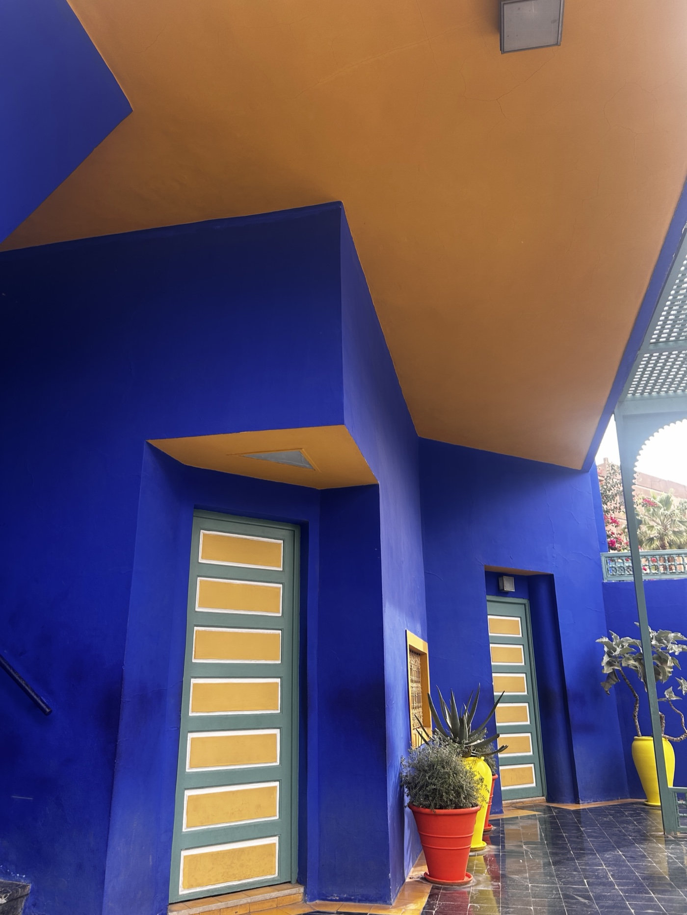
I recently visited Jardin Majorelle in Marrakech. It is a botanical garden built in the 1920s by French painter Jacques Majorelle, who covered every surface in a cobalt blue so intense it became inseparable from his name. Yves Saint Laurent loved it enough to buy and restore it after Majorelle’s death, saving it from demolition.
The blue is so saturated it almost looks wet. Standing in it, you feel the colour before you make sense of it, something that provokes a reaction before you have time to form an opinion on whether it is right or not. It is the kind of choice that has been almost entirely absent from a decade of design thinking, which is what makes the current panic about AI and creative flatness so hard to take seriously.
The worry is that these tools produce muted, generic, slightly soulless visuals, and that we are heading for a world where everything looks the same. Sage, dusty pink, off-white, all of it tasteful and forgettable.
But AI didn’t make design beige. We did this ourselves, through a decade of quiet competition over who could desaturate furthest, lowercase furthest, soften furthest. A generation of companies ran the same playbook, and every studio that wanted to look credible fell in behind them.
Friendly humanoid illustrations that all share a common ancestor, lowercase logos that look nervous about being seen. The models trained on all of that and concluded it must be what good design looks like. They are producing what they have been trained on.
What AI has done is make the problem visible. Designers and marketers have been making safer and safer choices for years, hiding behind the language of restraint and minimalism and timelessness, and now we can see it produced at scale with nowhere to look away.
Majorelle picked cobalt for a building in a city of ochre, the wrong choice by every reasonable measure, and people are still going there to photograph it a hundred years later. That move, where someone backs a colour that doesn’t fit and turns out to be right, is the move modern design has mostly stopped making. AI can’t make it either, but blaming the tools is letting ourselves off the hook. The colour debate is really a conviction debate.
The models will keep averaging, because that is what they do, but what they average from is still something we get to decide. We are swimming in a sea of beige, but it is genuinely exciting to see design talent starting to push through and take that on.
Opinion
Five years on, my Peloton is the most useful product I own. It's the only one still paying attention, which says something about IoT.
Opinion
Most websites weren't designed to be queried. They were designed to be visited. That distinction is about to matter more than most organisations realise.
Opinion
AI has made it cheaper and faster to build digital products than ever. But without governance, ownership and direction, that speed creates technical debt, digital waste and teams left maintaining systems they did not design.
We bring senior digital leadership across technology, product and sustainability.